The Setup tab allows you to configure the data that will appear in the graph and the type of graph that will be displayed. The tab contains the following:
Filter: This button displays the Filter dialog box, which allows you to restrict the data used in the graph before it is retrieved from the database.
As of Date: This field allows you to use data from a particular time in the past (rather than current data) for the report. Note: This will only work if the tables on which the report is based are configured to support temporality.
Graph type set-up table: The table shown in the window shows the type of graph to be created as well as columns to select the data to be shown in the graph. One of five types of graphs may be selected:
Depending on the type of graph selected, different columns will appear to configure the data for the graph. Use the links above for more information on each graph type.
General Graph Type
The General type of graph plots any X-axis variable against a user-defined summarization of a Y-axis value. This graph differs from the other graph types in that you can define how the Y axis is summarized. The available aggregate functions include:
- Average of a user-selected variable.
- Count of a user-selected variable (number of non-null occurrences of the variable within each category and series combination).
- Maximum of a user-selected variable.
- Minimum of a user-selected variable.
- Summation of a user-selected variable.
When you select General from the drop-down list in the Graph Type column, the graph set-up table displays the following columns to configure the General graph type:
- Aggregate: This column provides a drop-down list that contains functions. The system will process the data for the Y-axis values within each category and "colored by" combination according to the function you select in this column.
- Category: This column provides a drop-down list that contains the available categories that will be displayed along the X axis of the graph. The system will partition the data by the category you select in this column.
- Colored By: This column provides a drop-down list that contains the available parameters to further partition the data selected in the Category column. The data will be partitioned by category as well as by the parameter you select in this column. For example, if the Category value is Section and the Colored By value is Direction, then the graph will show colored bars for each direction for each section. (If you select the value No Series for this column, the data is not further partitioned.)
- Values: This column provides a drop-down list that contains the available values for the Y axis of the graph. The system processes the selected data according to the function selected in the Aggregation column.
Conditional Graph Type
The Conditional type of graph summarizes values only if the values pass a specified criterion. This type of graph first retrieves all rows from the database that pass the filter. Then, the application groups the data to create "cells" by category (and, optionally, by a secondary, "by color" category). Finally, for each cell, it calculates and reports the percentage of the measurement units that pass the conditional criteria out of all measurements within that cell.
A Conditional graph retrieves all the rows in the database that pass through the filter, but then calculates a percentage that meet the conditional criterion established by the user. A subtle but significant difference exists between a filter and the conditional criterion: a Conditional graph always reports the percentage of measurement units that pass the conditional criteria compared to the total measurement units that pass through any defined filters.
For conditional percentage calculations:
- The numerator of the percentage (how much meets the condition) excludes from this total any record where the "condition by" column value doesn't exist (is null).
- The denominator of the percentage (the entire quantity) includes in this total all records regardless of whether the "condition by" column value exists or not (is null).
- If you want a conditional percentage to exclude missing values in the conditional variable, use the Filter button to filter the conditional variable to ">=0". This will remove missing conditional values from the formula (that is, from the denominator, since the numerator always excludes them).
Example
To illustrate this important point, suppose we were to create two conditional graphs on a network with 1000 miles of pavement and we were interested in knowing the percentage of the network that was in "Fair or Better" condition. The conditional criterion defined for these graphs is the number of roadbed miles in fair or better condition as defined by the user (for example, Ride Quality Index is greater than 2.5).
For this example, suppose also that for the selected year five hundred miles were in fair or better condition (50% of the total network mileage). If we set-up a filter using the Fair or Better criterion, then the graph would only retrieve rows in fair or better condition. Thus the graph would report that 100% of the network is in fair or better condition (remember we retrieved only fair or better roads by defining the filter). This result, although correct, is clearly misleading and not what was intended.
On the other hand, if we let the full network pass through the filter and then summed the mileage actually in fair or better condition (500 miles), the graph would correctly report that only 50% of the network is in fair or better condition. Thus it pays to be careful when defining filters when creating conditional distribution graphs.
Columns to Configure a Conditional Graph
When you select Conditional from the drop-down list in the Graph Type column, the graph set-up table displays the following columns to configure the Conditional graph type:
- Category: This column provides a drop-down list that contains the available categories that will be displayed along the X axis of the graph. The system will partition the data by the category you select in this column.
- Colored By: This column provides a drop-down list that contains the available parameters to further partition the data selected in the Category column. The data will be partitioned by category as well as by the parameter you select in this column. For example, if the Category value is Section and the Colored By value is Direction, then the graph will show colored bars for each direction for each section. (If you select the value No Series for this column, the data is not further partitioned.)
- Condition By: This column provides a drop-down list that contains the available conditional variable columns. Select the column you wish to use for specifying the conditional criterion.
- Condition Sign: This column provides a drop-down list that contains the operators for the condition, which are the following:
< The conditional column must be less than the specified value to pass the condition.
<= The conditional column must be less than or equal to the specified value to pass the condition.
= The conditional column must be equal to the specified value to pass the condition.
> The conditional column must be greater than the specified value to pass the condition.
>= The conditional column must be greater than or equal to the specified value to pass the condition.
- Condition Value: This column shows the value for the condition.
- Values: This column provides a drop-down list that contains the available values for the Y axis of the graph. The system processes the selected data according to the function selected in the Aggregate column.
Distribution Graph Type
The Distribution type of graph shows summarized values of one variable plotted against another variable. It is usually displayed as a bar chart. A simple example is the number of roadbed miles within each maintenance district on a highway network.
When you select Distribution from the drop-down list in the Graph Type column, the graph set-up table displays the following columns to configure the Distribution graph type:
- Accumulation: This column determines how the data is accumulated. A drop-down list provides two choices: Frequency or Cumulative. When you select Frequency, the results indicate "how much" (as defined by the indicator in the Present By column) there is for each category and "colored by" combination. When you select Cumulative, the system takes the "frequency" results and then accumulates for each "colored by" level across all categories.
- Category: This column provides a drop-down list that contains the available categories that will be displayed along the X axis of the graph. The system will partition the data by the category you select in this column.
- Colored By: This column provides a drop-down list that contains the available parameters to further partition the data selected in the Category column. The data will be partitioned by category as well as by the parameter you select in this column. For example, if the Category value is Section and the Colored By value is Direction, then the graph will show colored bars for each direction for each section. (If you select the value No Series for this column, the data is not further partitioned.)
- Present By: In this column you select the type of distribution to be calculated. The choices are:
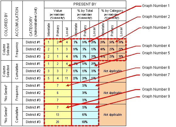
- % by Category Values – You should only select this type when the Accumulation column is set to Frequency and there is a "colored by" variable. When these conditions are met, this type shows in the Values column the conditional percentage per series. For example, in the table shown below, this setting would hold the road type constant (say, Interstate), total the values across all districts (which equals 5), and then show the percentage for each district to the total for all districts (District 1 = 1/5; District 2 = 2/5; and District 3 = 2/5).
- % by Series — When the Accumulation column is set to Frequency, this selection shows in the Values column the percentage of its total for each category and "colored by" combination. When the Accumulation column is set to Cumulative, these values are then accumulated for each "colored by" level across all categories. For example, in the table shown below, this setting would hold the category constant (say, District 1), total the values across all road types (Interstate + Primary + Local = 7), and then show the percentage of each road type to the total of all road types (Interstate = 1/7; Primary = 2/7; and Local = 4/7).
- % of Total – When the Accumulation column is set to Frequency, this selection shows in the Values column the percentage of its total for each category and "colored by" combination. When the Accumulation column is set to Cumulative, these values are then accumulated for each "colored by" level across all categories. For example, in the table shown below, this setting would calculate a total for all road types and all districts (which is 21). It would then calculate the percentage of each district/road type combination as a total of all combinations (District 1/Interstate = 1/21; District 1/Primary = 2/21; and so forth).
- Value — When the Accumulation column is set to Frequency, this selection shows in the Values column the total summation of all values for each category and "colored by" combination. When the Accumulation column is set to Cumulative, these values are then accumulated for each "colored by" level across all categories.
- Values — This column provides a drop-down list that contains the available values for the Y axis of the graph. The system processes the selected data according to the function selected in the Aggregate column.
Example Results
Shown below are two sets of tables. The first shows original data, while the second shows the graph results based upon this data for all combinations of graph attributes.
Original data, showing what values should appear for each category and "colored by" combination, is shown in the table below.

The following table shows the graph values per administrative unit (category) and road class ("colored by"). It shows what values would appear for each "colored by," accumulation, and "present by" selection. Note that these combinations result in nine different graphs.
Cumulative Graph Type
Cumulative graphs are used for building frequency or probability density, or cumulative probability density functions, for selected variables. For example, the distribution of alligator cracking is best represented as a histogram graph that displays the distribution of the alligator Index variable for one or more years.
When you select Cumulative from the drop-down list in the Graph Type column, the graph set-up table displays the following columns to configure the Cumulative graph type:
- Accumulation: This column determines how the data is accumulated. A drop-down list provides two choices: Frequency or Cumulative. Frequency shows a normal histogram of the sum of the measurement column values within each bin. Cumulative shows a cumulative distribution histogram with the sum of the measurement column with values less than or equal to the value of each bin.
- Colored By: This column provides a drop-down list that contains the available parameters to further partition the data selected in the Category column. The data will be partitioned by category as well as by the parameter you select in this column. For example, if the Category value is Section and the Colored By value is Direction, then the graph will show colored bars for each direction for each section.
- Distributed By: This column provides a drop-down list that contains the available parameters for "distributed by" (category) values on the X axis of the graph. When you select a parameter from the list, the application will divide the data into these categories according to the settings for From Value, To Value, and Number of Divisions columns.
- From Value: This column shows the value at the beginning (nearest the Y axis) of the X axis.
- Number of Divisions: This column shows how the range between the From Value and To Value is divided. For example, if the From Value is 0 and the To Value is 4, setting Number of Divisions to 4 causes the X axis to have five equally spaced tick marks — one tick mark for each value (0, 1, 2, 3, 4). On the other hand, if you set Number of Divisions to 2, there will be three equally spaced tick marks (0, 2, 4).
- Present By: This column determines how the data is presented. A drop-down list provides two choices: Value or %. When you select Value, the real value (that is, the summation) will be shown. When you select %, the percentage of values compared to the total on the Y-axis of the graph will be shown.
- To Value: This column shows the value at the end of the X axis.
- Values: This column provides a drop-down list that contains the available values for the Y axis of the graph. The system processes the selected data according to the function selected in the Accumulation column.
Weighted Avg. Graph Type
The Weighted Average type of graph plots any X-axis variable against a weighted average of a Y-axis value. This graph is similar to the General type of graph, with two exceptions: (1) the aggregation function is always "average"; and (2) it is a weighted average, not a simple average, and so needs a "weighting" variable.
When you select Weighted Avg. from the drop-down list in the Graph Type column, the graph set-up table displays the following columns to configure the Weighted Average graph type:
- Category: This column provides a drop-down list that contains the available categories that will be displayed along the X axis of the graph. The system will partition the data by the category you select in this column.
- Colored By: This column provides a drop-down list that contains the available parameters to further partition the data selected in the Category column. The data will be partitioned by category as well as by the parameter you select in this column. For example, if the Category value is Section and the Colored By value is Direction, then the graph will show colored bars for each direction for each section.
- Weighted Average Of: This column shows the column being averaged. A drop-down list is provided for you to select the column being averaged. This list contains the available "value" columns for the Y axis of the graph.
- Weighted By: This column provides a drop-down list that contains the available parameters for use in calculating a weighted average. For example, for a length-weighted average of daily traffic, select Length from the drop-down list in this column (and select Daily Traffic from the drop-down list in the Weighted Average Of column).